
See how busy your chats are and how fast you reply
Quick answer
The Dashboard shows how busy your WhatsApp chats are, how happy customers are with your AI assistant and your team, and how fast each of them replies. It covers the last 7 days by default, and each headline figure is compared with the period immediately before it.
It is Monday before opening. You want to know whether last week's Saturday rush was busier than usual, whether customers left happy, and whether your team kept up during the lunch crowd.
The Dashboard is the first page you see after signing in. It answers those questions in one place: how many messages came in, when they arrived, how satisfied customers were, and how quickly your AI assistant and your team replied.
With it you can:
- Jump straight to chats and questions that are waiting on you.
- See your busiest hours so you can plan who covers them.
- Watch whether customer satisfaction is rising or slipping.
- Compare how fast your AI assistant and your team reply, hour by hour.
Until your WhatsApp Business account is connected, the Dashboard shows sample data, so you can see how each chart works before your own chats arrive.
Deal with what needs attention first
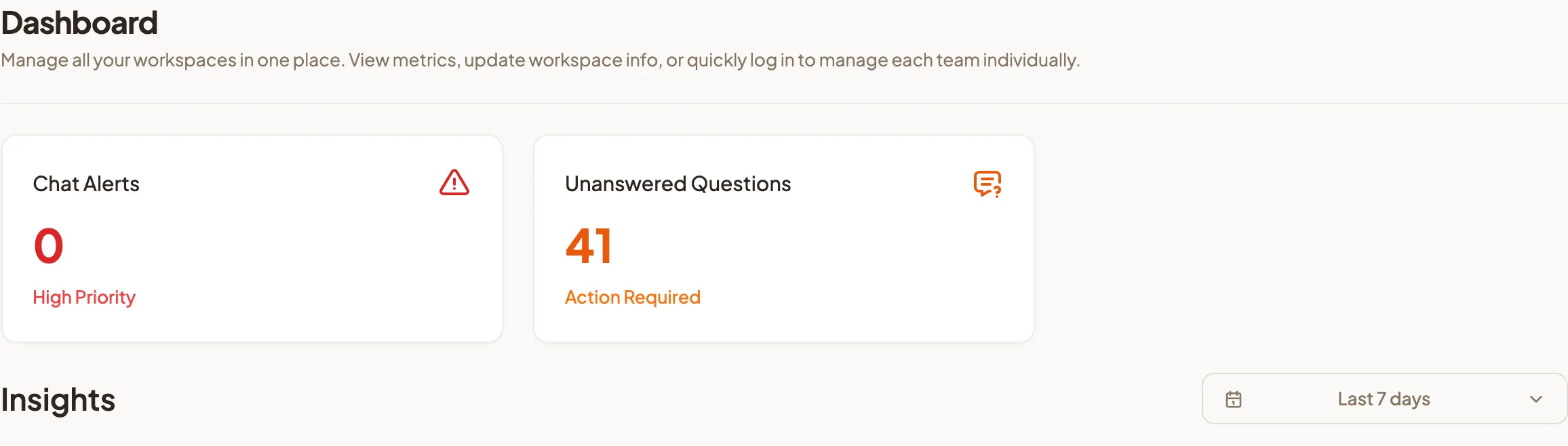
Two cards sit at the top of the page, each with a count.
- Chat Alerts, marked High Priority: chats your AI assistant has passed to your team. Select the card to open Chat Alerts and pick them up.
- Unanswered Questions, marked Action Required: questions your assistant could not answer. Select the card to open Unanswered Questions and teach it the answers.
Clearing these two before you read any chart is the quickest way to improve every number below them.
Choose the period
- Find Insights below the cards.
- Select the date picker on the right. It starts on Last 7 days.
- Pick a start and end date, then select Apply.
Each headline figure shows a percentage beside it. That is the change compared with the period of the same length immediately before the one you picked. Pick the last 7 days, and you are comparing this week with last week.
Read the Engagement charts
Engagement has three tabs. Each shows a headline figure with its change, and a chart underneath when you select it.
Total Messages
The total number of messages in the period. Select it to see Hourly Message Distribution, which shows the average number of messages at each hour of the day, split by customers, your AI assistant and your team.
What to do with it: find your peak hours. If customer messages climb at 12pm and 7pm, those are the hours to have someone watching chats, and the hours your AI assistant saves you the most.
Avg Messages Per User
The average number of messages each customer exchanges. Select it to see Daily Message Activity by Role, the daily average per user for Team Member, AI Assistant and Customer.
What to do with it: look for sudden spikes. A day where customers send far more messages than usual often means something confused them, such as a new promotion, a delivery delay or a menu change. Open Chat Analysis for that day to see what they were asking.
Unique Customer Engagement
How many different customers messaged you. Select it to see Daily Customer Reach, the number of different customers who chatted each day.
What to do with it: check whether a campaign or a new outlet brought in more people, not only more messages. Reach that rises after a campaign goes out is the clearest sign it worked.
Read customer satisfaction
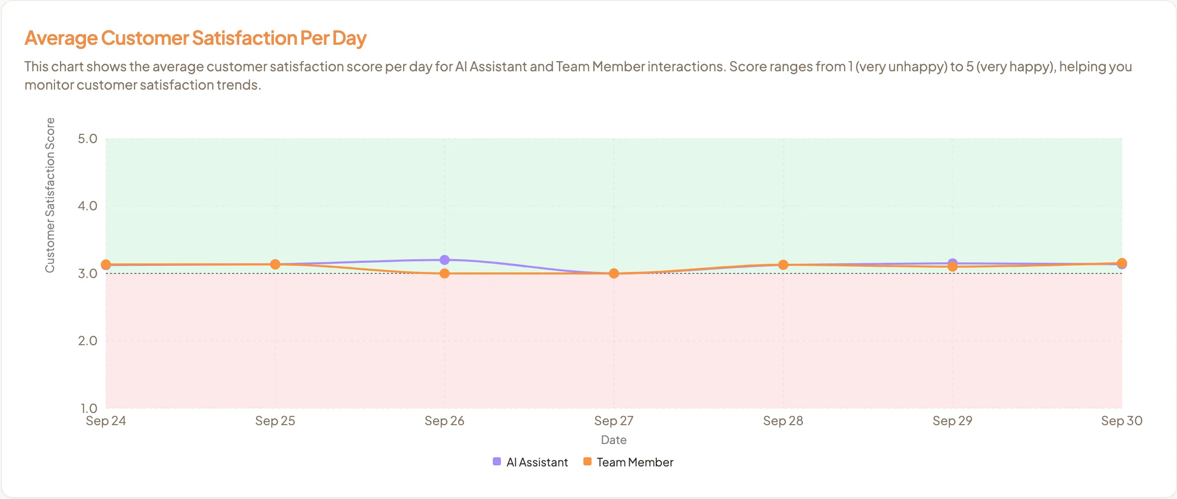
Average Customer Satisfaction Per Day shows one line for AI Assistant chats and one for Team Member chats. Scores run from 1, very unhappy, to 5, very happy.
- The green band, from 3 to 5, is where you want both lines to sit.
- The red band, from 1 to 3, means customers were more unhappy than happy that day.
- The dashed line marks 3, the midpoint.
What to do with it: when a line drops into the red band, open Chat Analysis, set Date Range to that day, and sort by Customer Satisfaction to bring the Unhappy chats to the top. If the AI Assistant line is lower than the Team Member line, the answers your assistant gives may need work in Instant Answers.
Read response times
Average Response Time has two tabs:
- AI Assistant Response Time, in seconds. Select it to see AI Assistant Hourly Average Response Time.
- Team Member Response Time, in minutes. Select it to see Team Member Hourly Average Response Time.
Each chart shows the average reply time at each hour of the day. For response times, a falling percentage shows in green because faster is better.
What to do with it: compare the team chart with your busy hours from Hourly Message Distribution. If replies slow down at the same hours messages pile up, add cover during those hours, or look at Agent Assignment so chats reach someone who is on shift.
Finish setting up with the checklist
If you are an Admin and your workspace is still being set up, a Get started with HeyBirdy checklist appears at the top of the Dashboard. It walks you through connecting WhatsApp, training your assistant, testing it, and inviting your team, and it tracks what you have finished.
You can collapse or dismiss it. If you dismiss it before every step is done, select the rocket button in the top bar (Show setup guide), or go to Settings, then Workspace Settings, find Setup Guide, and select Reopen. The steps themselves are explained in Getting started.
Read the Dashboard once a week, act on the one chart that looks wrong, and check whether it moves the week after. That is how the numbers stop being a report and start being a plan.